//PLANNING A NEW HOTEL WEBSITE?
Most people don’t jump into their car without a plan of where they are going. Building a website is much the same. Before you dive into the content (words, pictures, videos etc) you need some kind of plan and purpose for your website. Thinking about how your guests will experience your site and making it as simple and easy for them to navigate, find the information they need and make a booking is a good place to start.
Until recently, accommodation businesses would have had to invest thousands, if not tens of thousands of dollars, into building a beautiful, simple and easy-to-use website. However now, with tools such as squarespace.com, wix.com and wordpress.com you can quite literally have a desktop, mobile and tablet optimised website built within days (if not hours). And all without any web design or coding experience.
To show how far much planning you can do on a website we will take you through a site some of our creative team (from the team at Bonsta.co) worked on for a medium-sized campaign website for Tourism Australia. You may not need to go to the same extent with your planning, however the following example might help with your process.
Multi award winning 'Someday' campaign, invited Americans to win one of 52 one-week long trips on offer. American’s always say they’ll come and visit Australia someday. But they don’t always come. How could we show them what Australia is really like, and get them to come today?
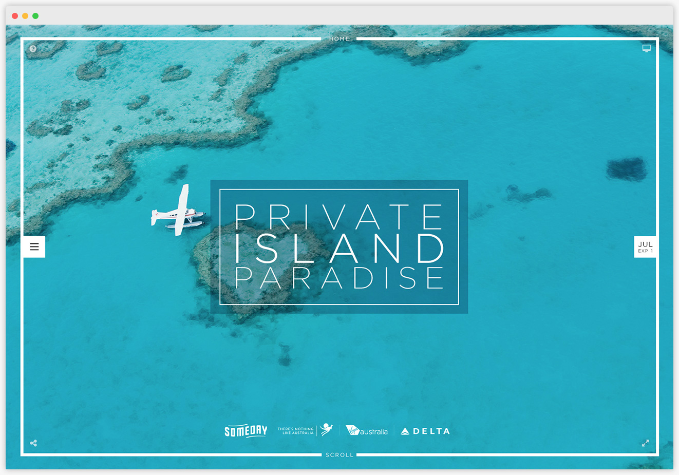
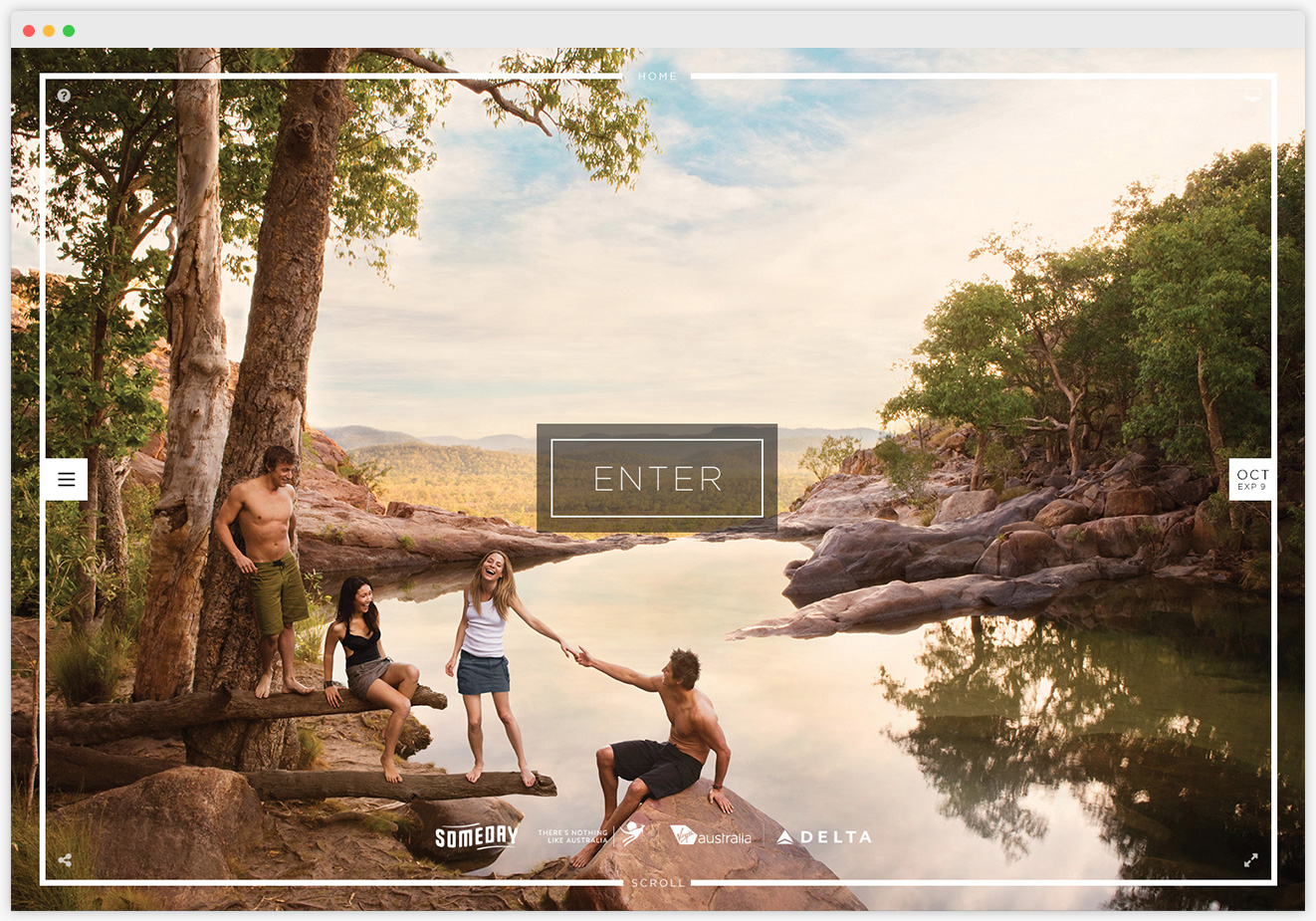
Together, Tourism Australia, Virgin Australia and Delta Air Lines created ‘Someday’ – the interactive web experience where you could win one of 52 amazing Someday trips down under by simply guessing where they’re located in Australia.
Almost immediately, they had over 600,000 visits to the website. More than 465,000 entires. That’s over 16,000 entries per day. People were spending an average of 13.4 minutes on the website – more than tripling the industry standard. The campaign delivered 250 million impressions, which contributed to an increase of 38.18% to Virgin Australia’s overall annual revenue.
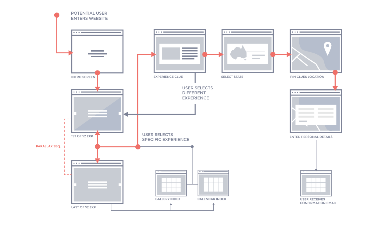
User Flow
To help encourage users to come to Australia someday, there was 52 ‘some days’ to choose from. That’s one a week for a full calendar year. Each ‘someday’ includes a trip for 2 to Australia, a weeks accommodation and a unique Australian experience.
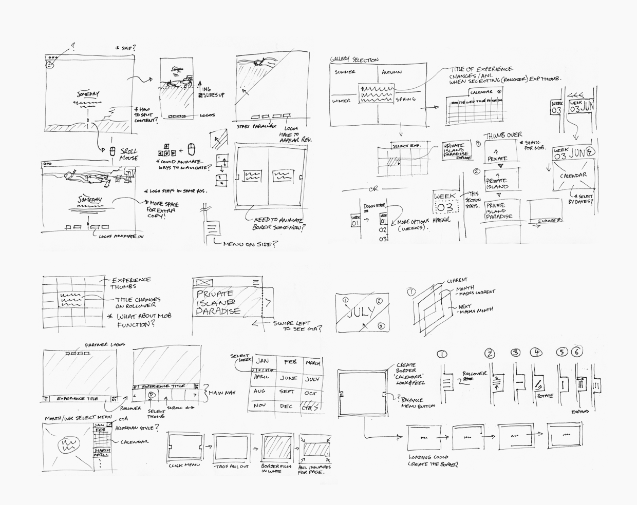
Wireframes
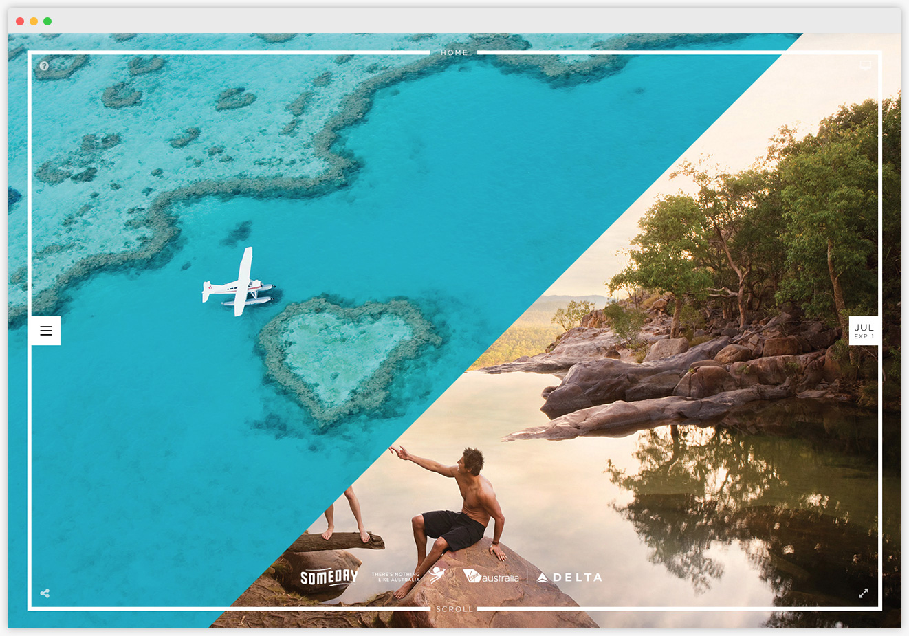
The site required exploration of all content, with a competition entry mechanism. This used parallax-scrolling navigation, resulting in an extremely rich and visually engaging user experience. During this process, various options were explored that where showcased.
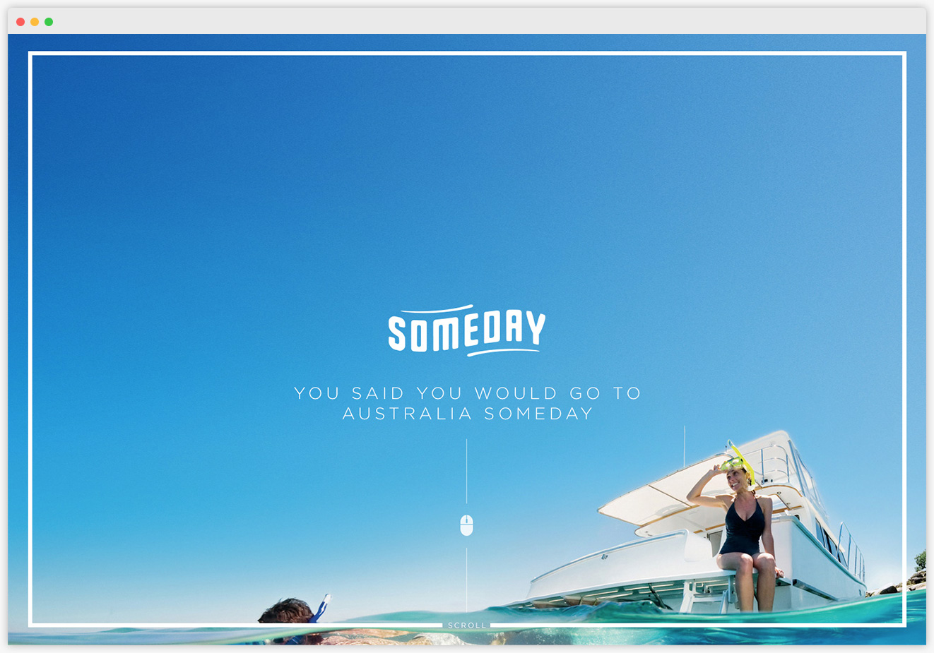
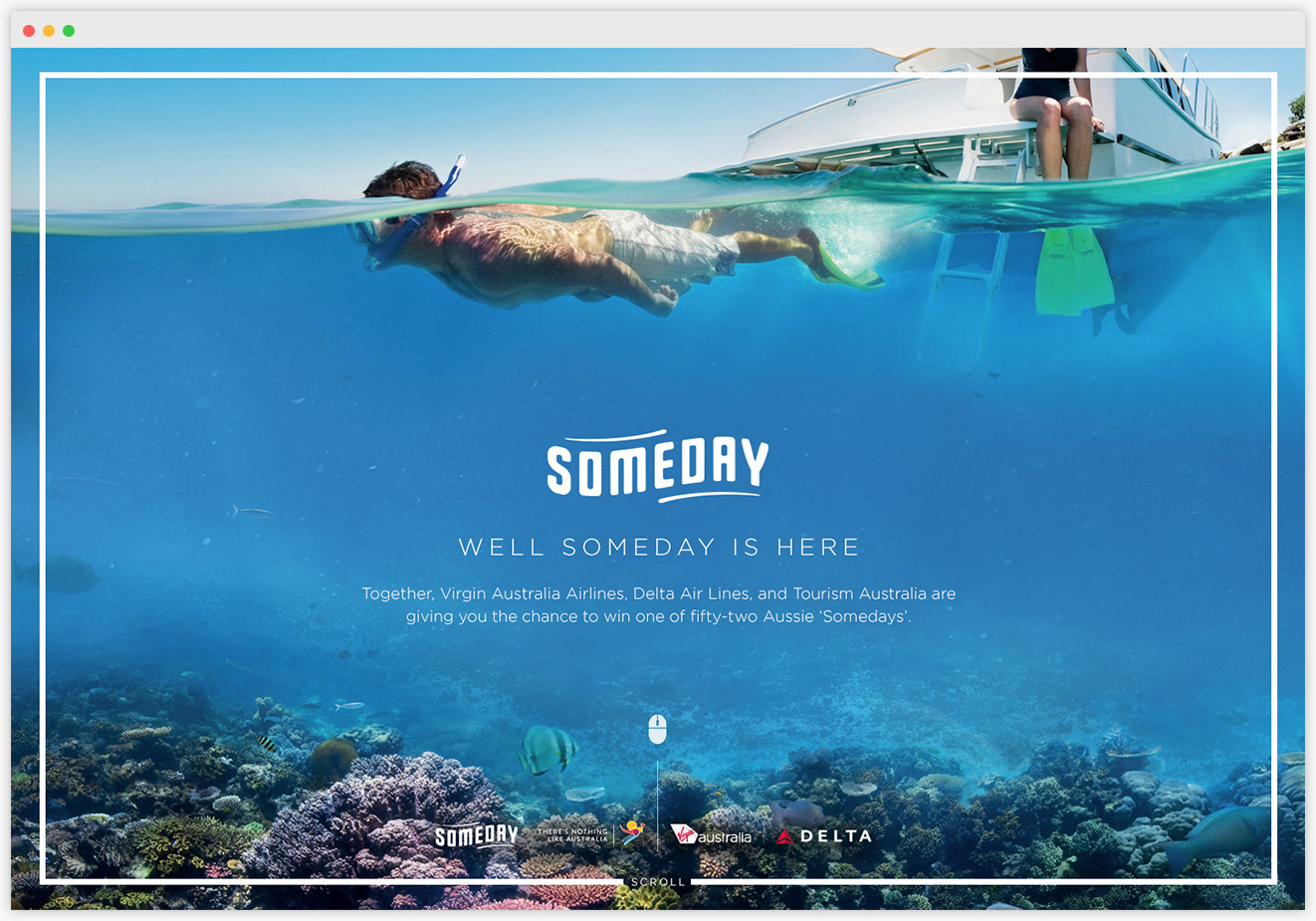
UI & Interaction
The outcome was a new digital design language, which focused on great typography and minimalist design. The experience's photography became the site's centerpiece.
Check out the case study video below.


